People building brands often share a single ambition: for a specific color—Tiffany’s blue, Hermès’ orange—to be uniquely theirs as a registered trademark. And that hope usually narrows into one question: how long, and how widely, must we use it before the color is recognized as ours?
In late August 2026, paperwork over a single shade of green moved on both sides of the Pacific. On 25 August, the U.S. Trademark Trial and Appeal Board affirmed an examiner’s refusal to register the green applied to the legs of surveying tripods. A day later, on 26 August, in Korea, Olive Young filed a response to an office action issued against its own green. Both cases grapple with a central question: can a single color function as a trademark? But they are stuck at different places — and that difference is very nearly everything a company hoping to turn color into an asset needs to understand.
A color can be a trademark, but there are two thresholds
That a color standing alone can function as a trademark was settled in the United States long ago. In 1985, the Court of Appeals for the Federal Circuit held in the Owens-Corning pink insulation case that a color may be registered where long use has led consumers to recognize it as the mark of a particular company (In re Owens-Corning Fiberglas Corp., 774 F.2d 1116). In 1995, the Supreme Court confirmed in Qualitex Co. v. Jacobson Products Co., 514 U.S. 159, that color alone is in principle registrable — while drawing the boundary in the same breath: a functional color is not.
So a brand seeking to register a color faces two thresholds. The first is distinctiveness. A color does not, by itself, tell anyone where a product comes from, so the applicant must prove that through long and extensive use consumers have come to think of the brand on seeing the color alone. The second is functionality. If the color contributes to the performance, the safety or the usability of the product, no one may monopolize it as a trademark.
Between the two there is an order, and functionality stands in front. This rigid priority explains why the U.S. case failed to clear the first hurdle. Distinctiveness is a requirement that time and marketing spend can fill. Functionality, however, is a fundamental hurdle that cannot be overcome through duration alone.
The U.S. case failed at the first threshold
The application at issue covered Pantone 2297C green applied to the legs of surveying tripods (Serial No. 98404066; goods: “Construction and Surveyor Tripod”). The applicant had sought registration on the U.S. Supplemental Register, a register for marks that are not yet sufficiently distinctive — a mechanism with no counterpart in Korean trademark law.
The Board never reached the question of distinctiveness. The refusal on functionality grounds under Section 23(c) of the Lanham Act was affirmed as it stood. Applying a highly visible color to tripod legs improves visibility on construction and survey sites and so contributes to safety; the color was therefore held to be function, not ornament. A functional mark earns no place even on the Supplemental Register. Which is why the decision contains no discussion whatsoever of acquired distinctiveness.
What supported the functionality finding was not patent literature or technical evidence, but the applicant’s own sales material. Its website introduced the product as one that “out-performs others and gets seen on the jobsite with UV-resistant high-visibility,” and described it as “the first hi-vis heavy-duty composite tripod designed for all environments”; high visibility appeared as a selling point in retail listings as well. Sentences written to sell the product were quoted back as evidence that its color performs a function.
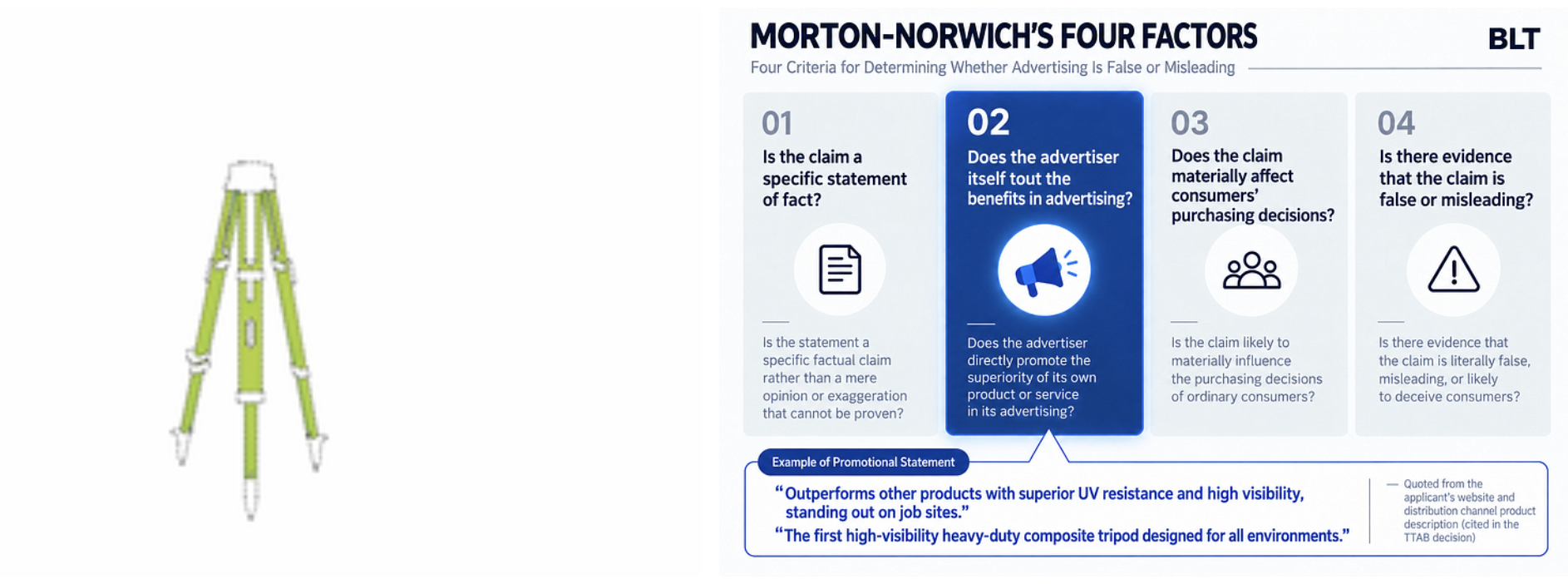
The U.S. Trademark Trial and Appeal Board found that this green color serves to improve visibility at the scene.
The basis was the applicant’s own sales copy. (Source: USPTO TSDR·TTAB decision, BLT reconstruction)
The Korean case is standing at the second threshold
The matter proceeding in Korea in the same week is of a different character. CJ Olive Young — the country’s dominant health-and-beauty retail chain — filed in 2026 to register its signature green as a single-color mark for Class 35 retail services (Application No. 40-2026-0065496). The Ministry of Intellectual Property issued an office action on 27 May; ahead of the 27 July due date Olive Young requested an extension, and filed its response on 26 August.
The grounds cited were Article 33(1)(vi) and (vii) of the Korean Trademark Act: the mark lacks distinctiveness. The examiner’s reasoning runs along two lines. One is that the mark is “a single-color mark, and therefore a simple mark.” The other is that “the color is likely to be perceived by ordinary consumers not as an indication of source, but merely as design applied to the designated goods.” (Translations of the Korean original.) Consumers, in other words, will see the color and think design, not company.
Here the contrast with the U.S. case becomes sharp. Nothing in the Korean action suggests that Olive Young’s green performs any function in retail services. In the Korean case, there is no issue with functionality; the conflict centers entirely on the second hurdle: distinctiveness. The green on a tripod was doing a job — safety — and was blocked at the outset. The green in a store does no job at all, and precisely for that reason there is still something to argue about. The more useless a color is, the more easily it becomes a trademark. It is a slightly paradoxical structure.
A refusal of this kind is the sort that can be overcome. The orthodox answer to a finding that a color lacks inherent distinctiveness is acquired distinctiveness, and Korean trademark law leaves that door open: a mark used before filing may be registered where, as a result of that use, consumers have come to recognize it as indicating a particular source. The question is what proves that recognition.
Examination practice is fairly settled on what it wants to see. First, on what goods, in what form, for how long and in which regions the color has been used continuously. Second, the revenue and market share over that period, and the methods, duration and cost of advertising and promotion. Third, objective consumer survey evidence showing that the public in fact connects the color with the brand. That list is exactly what a brand intending to turn color into an asset should begin collecting today.
There is a Korean case that made it through. Korea Ginseng Corporation obtained registration for the color combination used on its CheongKwanJang products — red and black divided horizontally with a gold line, a mark made of color alone, with no word and no device. Filed in July 2019, refused in December 2020 for lack of distinctiveness, the refusal was cancelled by the Intellectual Property Trial and Appeal Board and registration followed in October 2022. Assembling the material described above and getting through examination took more than three years from filing to registration. It is reported to be the first color-only registration obtained by a Korean company, following the gold of the multinational brand Haribo.
Set the two Korean matters side by side and one practical difference stands out.
What CheongKwanJang registered was a combination of colors; what Olive Young applied for is a single color. And the office action in the Olive Young case folded the observation that the mark is “a single-color mark, and therefore a simple mark” into its distinctiveness analysis. That claiming one color outright is the hardest road in color trademark practice is no less true in Korea than anywhere else.
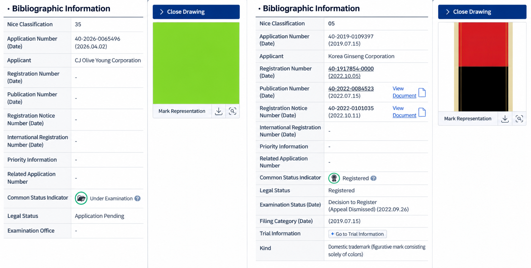 A single color and a combination of colors. Two paths by which color becomes a trademark in Korea and the resulting outcomes.
(Source: Intellectual Property Office Notice of Submission of Opinions, KIPRIS)
What brands with signature colors actually secured, and what they layered on top
So what did the brands that cleared these thresholds actually end up holding? The first thing to confirm is that they did in fact obtain color trademarks.
The earliest example is the Owens-Corning pink already mentioned. In building materials — a field where color is read as function more readily than as aesthetics — pink had nothing to do with insulating performance, and the company had used that color and no other for many years. What deserves attention is the form of the registration. The mark description of the registration issued on 29 August 2000 reads: “The mark consists of the color pink as applied to the entirety of the goods. The dotted outline of the goods is intended to show the position of the mark and is not a part of the mark.” (Reg. No. 2,380,742, Class 17, building insulation.) The claim was not to a color in the abstract; it fixed in words which goods the color sits on and how.
Tiffany, for its part, states publicly that Tiffany Blue has been registered as a color trademark since 1998, and that in 2001 the color was standardized as a custom color created by Pantone exclusively for Tiffany. Not available to the public, it is named ‘1837 Blue’ after the year of the company’s founding.
Read only this far and the conclusion would seem to be “register the color.” Follow what these brands actually did a little further, however, and a different picture emerges. Not one of them entrusted the protection of its signature color to a color trademark alone. The color mark was one layer among several, and beside it they set rights of a different nature.
Tiffany first captured the name of the color as a word mark. “TIFFANY BLUE” was registered on 1 September 2015 (Reg. No. 4,804,204) for “Jewelry; jewelry featuring the color blue as an integral component of the jewelry.” “TIFFANY BLUE BOX” is a separate registration (Reg. No. 4,550,678, registered 17 June 2014). A color mark forces you to argue how similar the other side’s color is; a word mark turns the fight into something far simpler the moment the other side uses the words “Tiffany Blue.” A color can be imitated. A name cannot.
And there is one further layer. Tiffany secured the object carrying the color itself — as a three-dimensional trademark in Korea. The specimen consists of three photographs of a paper shopping bag in Tiffany Blue, shot from the front, from the side and at an angle, and the registration gazette carries the notation “this mark is three-dimensional; please refer to the original” (International Registration No. 1208903; international registration date 19 December 2013; registered 30 May 2017). The designated goods span thirteen classes from Class 3 to Class 35, and Class 16 expressly includes “printed paper shopping bags” and “bags [envelopes, pouches] of paper for packaging.” This was not a request to carve out a color; it was a claim over the shape of an object — a shopping bag — with that color on it. If the color trademark is the hardest road, this one preserves the same color and can be travelled far earlier.
Louboutin’s red sole is a case where the scope of a registration was narrowed after the fact. When it issued on 1 January 2008 (Reg. No. 3,361,597, Class 25, women’s high fashion designer footwear), the mark description read simply “the mark consists of a lacquered red sole on footwear,” with red claimed as a feature of the mark. In September 2012, however, the Second Circuit held that the right extends only to a red outsole contrasting with the upper, and ordered the registration itself limited to that scope (Christian Louboutin S.A. v. Yves Saint Laurent Am. Holdings, Inc., 696 F.3d 206). The description today accordingly reads: “The mark consists of a red lacquered outsole on footwear that contrasts with the color of the adjoining (‘upper’) portion of the shoe.” Monochrome red shoes cannot be stopped. If you do not narrow the placement and conditions of your color yourself, a court will do it for you.
Hermès’ orange shows that the answer changes when you change jurisdiction. The house obtained color trademark registrations in a number of countries, but in 2005 the European Union Intellectual Property Office refused the same application for lack of distinctiveness. That runs against the impression that European trademark examination is light-touch — but the two propositions operate on different levels. The EUIPO does not examine conflicts with earlier marks of its own motion, leaving that to opposition by rights holders; it does examine distinctiveness ex officio. And for a sign that lacks inherent distinctiveness, such as a color, registration through acquired distinctiveness requires that the recognition extend across the entire European Union. However famous a color may be in one or two member states, it will not clear that threshold if the same showing cannot be made for the rest. Indeed, cases in which color marks have been shaken at the maintenance stage for insufficient evidence in particular member states have continued in Europe up to the present. The reason is not that the brand was not strong enough; it is that the required geographic scope of proof is different.
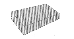
“The pink applied to the entire article.” The dotted line shows the article’s outline only and is not part of the mark.
(Source: USPTO TSDR)
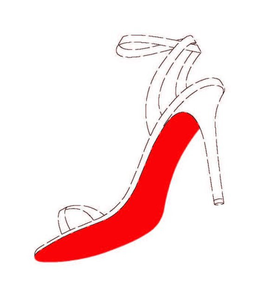
At the time of registration, it was “the red lacquer sole of the shoe,” but in 2012, by court order,
the condition “contrasting with the upper”) was added to the wording of the registration.
(Source: USPTO TSDR, 2nd Circuit Court of Appeals 2012)
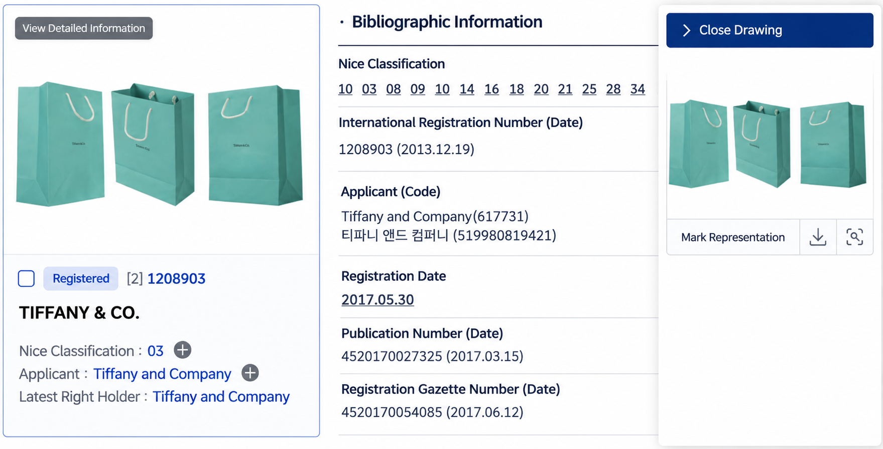
Caption: A registration photographing a colored object itself with the caption “This trademark is three-dimensional,
so please refer to the original.” written on the public notice.
(Source: Intellectual Property Office Registration Notices, Trademark Bulletin, KIPRIS)
So what should a brand do?
There are three things a brand can act on now.
First, decide what the color will sit on before you decide the color. Owens-Corning wrote “the color pink as applied to the entirety of the goods”; Louboutin wrote “a lacquered red sole on footwear.” Neither asserted a right to a color hanging in the air; each fixed the object and the placement in words and in a drawing. Not blue, but a blue packaging box. Not green, but a green storefront sign and shopping bag. The narrower the object, the smaller the scope you must prove and the fewer the points your opponent can attack.
Second, choose the vessel that matches the moment. There are three vessels for the same color, and each calls for a different timing. First comes the design right, in which color and shape are combined. It must be filed before the product or packaging is disclosed, but it can be secured in a matter of months. Next comes the three-dimensional trademark, which captures the object carrying the color. Tiffany’s paper shopping bag sits precisely here. Trademark law recognizes three-dimensional shapes as marks, so the shape of a packaging box, a paper bag or a container may be filed together with its color — and unlike a claim to a color carved out on its own, there is one additional distinctive element in the shape, which widens the room to argue in examination. Last comes the color trademark. It can only be attempted once a record of use has accumulated; for CheongKwanJang it took more than three years from filing to registration.
Reverse the order and the design right loses novelty while the color mark is refused for want of evidence. Keep to it, and the sales and advertising accumulated while the first two rights are in force become the very evidence the color mark needs. This is not a choice among three. Start with the design right, hold the ground with a three-dimensional mark on the colored packaging, and take the color trademark at the end — that is the best ending available.
Third, build the name of the color and the evidence together. As Tiffany did in registering “TIFFANY BLUE” separately, the name a brand gives its own color is examined as an ordinary word mark and therefore becomes a right far more quickly. In parallel, organize the evidentiary items listed above by periods during which the color did not change. What is easiest to overlook here is marketing documentation. Sentences that have explained the color as “easy to see” or “protective of the contents” become evidence of functionality; sentences that have explained it through the brand’s story become evidence of distinctiveness. For one and the same color, the sentences the marketing team writes decide which way the right will go.
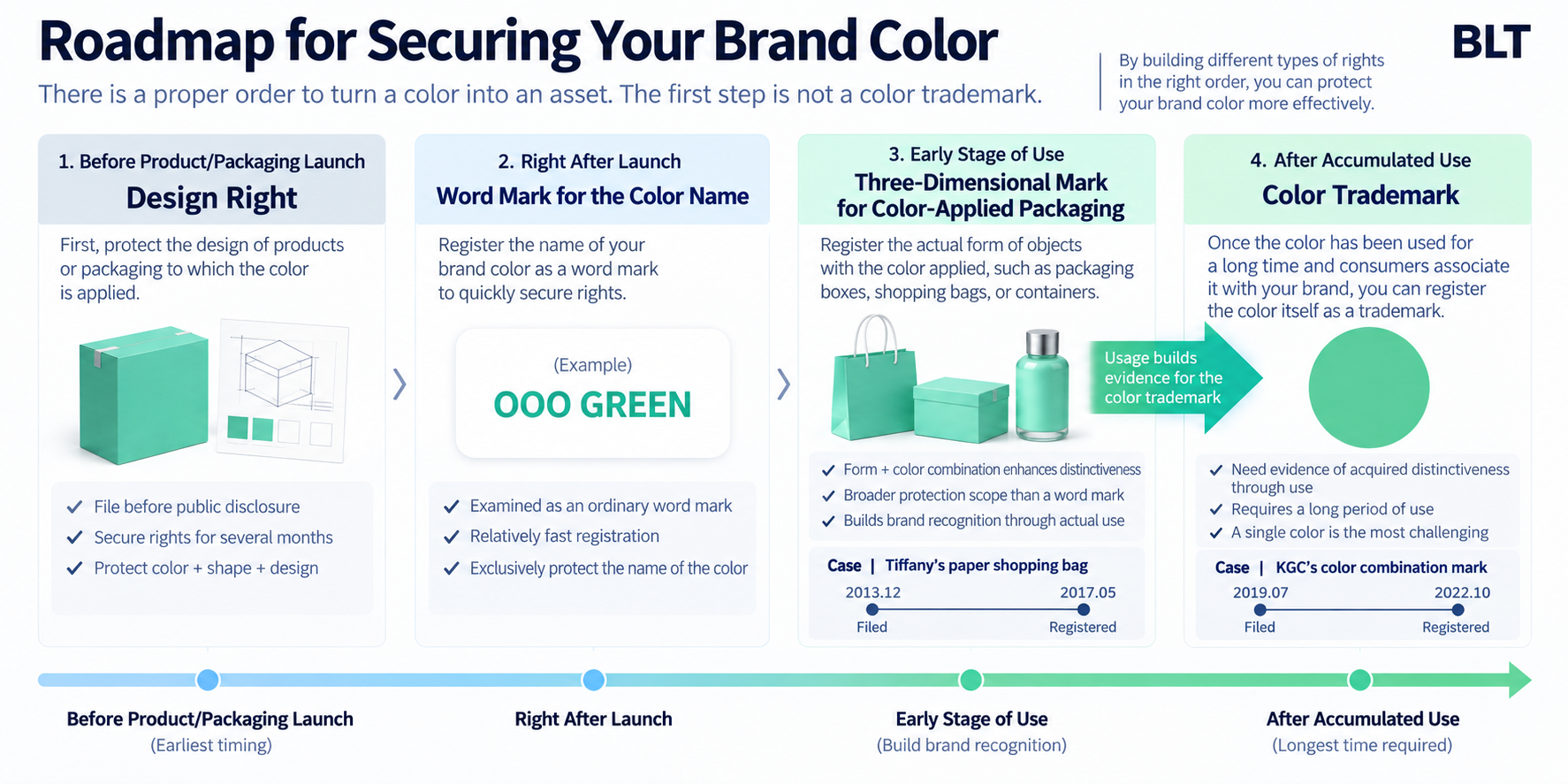 There is an order to turning color into an asset. The first thing that should be addressed is not the color mark.
What a consumer sees at the shelf, before reading the product name, is the color. And if the reason you use that color is “because it stands out,” that reason will one day come back as the ground that blocks your registration. Why does your brand use its color — for function, or for the story?
By Karl Taekyun Chung, Partner Attorney
and Head of Strategy, BLT Patent & Law Firm
#trademark #colortrademark #colormark #3Dtrademark #tradedress #distinctiveness #functionality #acquireddistinctiveness #secondarymeaning #OliveYoung #CheongKwanJang #TTAB #USPTO #KoreanIP #MinistryofIntellectualProperty #EUIPO #Qualitex #OwensCorning #TiffanyBlue #Louboutin #Hermes #MadridProtocol #designright #brandstrategy #BLTPatentLawFirm





People building brands often share a single ambition: for a specific color—Tiffany’s blue, Hermès’ orange—to be uniquely theirs as a registered trademark. And that hope usually narrows into one question: how long, and how widely, must we use it before the color is recognized as ours?
In late August 2026, paperwork over a single shade of green moved on both sides of the Pacific. On 25 August, the U.S. Trademark Trial and Appeal Board affirmed an examiner’s refusal to register the green applied to the legs of surveying tripods. A day later, on 26 August, in Korea, Olive Young filed a response to an office action issued against its own green. Both cases grapple with a central question: can a single color function as a trademark? But they are stuck at different places — and that difference is very nearly everything a company hoping to turn color into an asset needs to understand.
A color can be a trademark, but there are two thresholds
That a color standing alone can function as a trademark was settled in the United States long ago. In 1985, the Court of Appeals for the Federal Circuit held in the Owens-Corning pink insulation case that a color may be registered where long use has led consumers to recognize it as the mark of a particular company (In re Owens-Corning Fiberglas Corp., 774 F.2d 1116). In 1995, the Supreme Court confirmed in Qualitex Co. v. Jacobson Products Co., 514 U.S. 159, that color alone is in principle registrable — while drawing the boundary in the same breath: a functional color is not.
So a brand seeking to register a color faces two thresholds. The first is distinctiveness. A color does not, by itself, tell anyone where a product comes from, so the applicant must prove that through long and extensive use consumers have come to think of the brand on seeing the color alone. The second is functionality. If the color contributes to the performance, the safety or the usability of the product, no one may monopolize it as a trademark.
Between the two there is an order, and functionality stands in front. This rigid priority explains why the U.S. case failed to clear the first hurdle. Distinctiveness is a requirement that time and marketing spend can fill. Functionality, however, is a fundamental hurdle that cannot be overcome through duration alone.
The U.S. case failed at the first threshold
The application at issue covered Pantone 2297C green applied to the legs of surveying tripods (Serial No. 98404066; goods: “Construction and Surveyor Tripod”). The applicant had sought registration on the U.S. Supplemental Register, a register for marks that are not yet sufficiently distinctive — a mechanism with no counterpart in Korean trademark law.
The Board never reached the question of distinctiveness. The refusal on functionality grounds under Section 23(c) of the Lanham Act was affirmed as it stood. Applying a highly visible color to tripod legs improves visibility on construction and survey sites and so contributes to safety; the color was therefore held to be function, not ornament. A functional mark earns no place even on the Supplemental Register. Which is why the decision contains no discussion whatsoever of acquired distinctiveness.
What supported the functionality finding was not patent literature or technical evidence, but the applicant’s own sales material. Its website introduced the product as one that “out-performs others and gets seen on the jobsite with UV-resistant high-visibility,” and described it as “the first hi-vis heavy-duty composite tripod designed for all environments”; high visibility appeared as a selling point in retail listings as well. Sentences written to sell the product were quoted back as evidence that its color performs a function.

The U.S. Trademark Trial and Appeal Board found that this green color serves to improve visibility at the scene.
The basis was the applicant’s own sales copy. (Source: USPTO TSDR·TTAB decision, BLT reconstruction)
The Korean case is standing at the second threshold
The matter proceeding in Korea in the same week is of a different character. CJ Olive Young — the country’s dominant health-and-beauty retail chain — filed in 2026 to register its signature green as a single-color mark for Class 35 retail services (Application No. 40-2026-0065496). The Ministry of Intellectual Property issued an office action on 27 May; ahead of the 27 July due date Olive Young requested an extension, and filed its response on 26 August.
The grounds cited were Article 33(1)(vi) and (vii) of the Korean Trademark Act: the mark lacks distinctiveness. The examiner’s reasoning runs along two lines. One is that the mark is “a single-color mark, and therefore a simple mark.” The other is that “the color is likely to be perceived by ordinary consumers not as an indication of source, but merely as design applied to the designated goods.” (Translations of the Korean original.) Consumers, in other words, will see the color and think design, not company.
Here the contrast with the U.S. case becomes sharp. Nothing in the Korean action suggests that Olive Young’s green performs any function in retail services. In the Korean case, there is no issue with functionality; the conflict centers entirely on the second hurdle: distinctiveness. The green on a tripod was doing a job — safety — and was blocked at the outset. The green in a store does no job at all, and precisely for that reason there is still something to argue about. The more useless a color is, the more easily it becomes a trademark. It is a slightly paradoxical structure.
A refusal of this kind is the sort that can be overcome. The orthodox answer to a finding that a color lacks inherent distinctiveness is acquired distinctiveness, and Korean trademark law leaves that door open: a mark used before filing may be registered where, as a result of that use, consumers have come to recognize it as indicating a particular source. The question is what proves that recognition.
Examination practice is fairly settled on what it wants to see. First, on what goods, in what form, for how long and in which regions the color has been used continuously. Second, the revenue and market share over that period, and the methods, duration and cost of advertising and promotion. Third, objective consumer survey evidence showing that the public in fact connects the color with the brand. That list is exactly what a brand intending to turn color into an asset should begin collecting today.
There is a Korean case that made it through. Korea Ginseng Corporation obtained registration for the color combination used on its CheongKwanJang products — red and black divided horizontally with a gold line, a mark made of color alone, with no word and no device. Filed in July 2019, refused in December 2020 for lack of distinctiveness, the refusal was cancelled by the Intellectual Property Trial and Appeal Board and registration followed in October 2022. Assembling the material described above and getting through examination took more than three years from filing to registration. It is reported to be the first color-only registration obtained by a Korean company, following the gold of the multinational brand Haribo.
Set the two Korean matters side by side and one practical difference stands out.
What CheongKwanJang registered was a combination of colors; what Olive Young applied for is a single color. And the office action in the Olive Young case folded the observation that the mark is “a single-color mark, and therefore a simple mark” into its distinctiveness analysis. That claiming one color outright is the hardest road in color trademark practice is no less true in Korea than anywhere else.
(Source: Intellectual Property Office Notice of Submission of Opinions, KIPRIS)
What brands with signature colors actually secured, and what they layered on top
So what did the brands that cleared these thresholds actually end up holding? The first thing to confirm is that they did in fact obtain color trademarks.
The earliest example is the Owens-Corning pink already mentioned. In building materials — a field where color is read as function more readily than as aesthetics — pink had nothing to do with insulating performance, and the company had used that color and no other for many years. What deserves attention is the form of the registration. The mark description of the registration issued on 29 August 2000 reads: “The mark consists of the color pink as applied to the entirety of the goods. The dotted outline of the goods is intended to show the position of the mark and is not a part of the mark.” (Reg. No. 2,380,742, Class 17, building insulation.) The claim was not to a color in the abstract; it fixed in words which goods the color sits on and how.
Tiffany, for its part, states publicly that Tiffany Blue has been registered as a color trademark since 1998, and that in 2001 the color was standardized as a custom color created by Pantone exclusively for Tiffany. Not available to the public, it is named ‘1837 Blue’ after the year of the company’s founding.
Read only this far and the conclusion would seem to be “register the color.” Follow what these brands actually did a little further, however, and a different picture emerges. Not one of them entrusted the protection of its signature color to a color trademark alone. The color mark was one layer among several, and beside it they set rights of a different nature.
Tiffany first captured the name of the color as a word mark. “TIFFANY BLUE” was registered on 1 September 2015 (Reg. No. 4,804,204) for “Jewelry; jewelry featuring the color blue as an integral component of the jewelry.” “TIFFANY BLUE BOX” is a separate registration (Reg. No. 4,550,678, registered 17 June 2014). A color mark forces you to argue how similar the other side’s color is; a word mark turns the fight into something far simpler the moment the other side uses the words “Tiffany Blue.” A color can be imitated. A name cannot.
And there is one further layer. Tiffany secured the object carrying the color itself — as a three-dimensional trademark in Korea. The specimen consists of three photographs of a paper shopping bag in Tiffany Blue, shot from the front, from the side and at an angle, and the registration gazette carries the notation “this mark is three-dimensional; please refer to the original” (International Registration No. 1208903; international registration date 19 December 2013; registered 30 May 2017). The designated goods span thirteen classes from Class 3 to Class 35, and Class 16 expressly includes “printed paper shopping bags” and “bags [envelopes, pouches] of paper for packaging.” This was not a request to carve out a color; it was a claim over the shape of an object — a shopping bag — with that color on it. If the color trademark is the hardest road, this one preserves the same color and can be travelled far earlier.
Louboutin’s red sole is a case where the scope of a registration was narrowed after the fact. When it issued on 1 January 2008 (Reg. No. 3,361,597, Class 25, women’s high fashion designer footwear), the mark description read simply “the mark consists of a lacquered red sole on footwear,” with red claimed as a feature of the mark. In September 2012, however, the Second Circuit held that the right extends only to a red outsole contrasting with the upper, and ordered the registration itself limited to that scope (Christian Louboutin S.A. v. Yves Saint Laurent Am. Holdings, Inc., 696 F.3d 206). The description today accordingly reads: “The mark consists of a red lacquered outsole on footwear that contrasts with the color of the adjoining (‘upper’) portion of the shoe.” Monochrome red shoes cannot be stopped. If you do not narrow the placement and conditions of your color yourself, a court will do it for you.
Hermès’ orange shows that the answer changes when you change jurisdiction. The house obtained color trademark registrations in a number of countries, but in 2005 the European Union Intellectual Property Office refused the same application for lack of distinctiveness. That runs against the impression that European trademark examination is light-touch — but the two propositions operate on different levels. The EUIPO does not examine conflicts with earlier marks of its own motion, leaving that to opposition by rights holders; it does examine distinctiveness ex officio. And for a sign that lacks inherent distinctiveness, such as a color, registration through acquired distinctiveness requires that the recognition extend across the entire European Union. However famous a color may be in one or two member states, it will not clear that threshold if the same showing cannot be made for the rest. Indeed, cases in which color marks have been shaken at the maintenance stage for insufficient evidence in particular member states have continued in Europe up to the present. The reason is not that the brand was not strong enough; it is that the required geographic scope of proof is different.
“The pink applied to the entire article.” The dotted line shows the article’s outline only and is not part of the mark.

(Source: USPTO TSDR)
At the time of registration, it was “the red lacquer sole of the shoe,” but in 2012, by court order,
the condition “contrasting with the upper”) was added to the wording of the registration.
(Source: USPTO TSDR, 2nd Circuit Court of Appeals 2012)
Caption: A registration photographing a colored object itself with the caption “This trademark is three-dimensional,
so please refer to the original.” written on the public notice.
(Source: Intellectual Property Office Registration Notices, Trademark Bulletin, KIPRIS)
So what should a brand do?
There are three things a brand can act on now.
First, decide what the color will sit on before you decide the color. Owens-Corning wrote “the color pink as applied to the entirety of the goods”; Louboutin wrote “a lacquered red sole on footwear.” Neither asserted a right to a color hanging in the air; each fixed the object and the placement in words and in a drawing. Not blue, but a blue packaging box. Not green, but a green storefront sign and shopping bag. The narrower the object, the smaller the scope you must prove and the fewer the points your opponent can attack.
Second, choose the vessel that matches the moment. There are three vessels for the same color, and each calls for a different timing. First comes the design right, in which color and shape are combined. It must be filed before the product or packaging is disclosed, but it can be secured in a matter of months. Next comes the three-dimensional trademark, which captures the object carrying the color. Tiffany’s paper shopping bag sits precisely here. Trademark law recognizes three-dimensional shapes as marks, so the shape of a packaging box, a paper bag or a container may be filed together with its color — and unlike a claim to a color carved out on its own, there is one additional distinctive element in the shape, which widens the room to argue in examination. Last comes the color trademark. It can only be attempted once a record of use has accumulated; for CheongKwanJang it took more than three years from filing to registration.
Reverse the order and the design right loses novelty while the color mark is refused for want of evidence. Keep to it, and the sales and advertising accumulated while the first two rights are in force become the very evidence the color mark needs. This is not a choice among three. Start with the design right, hold the ground with a three-dimensional mark on the colored packaging, and take the color trademark at the end — that is the best ending available.
Third, build the name of the color and the evidence together. As Tiffany did in registering “TIFFANY BLUE” separately, the name a brand gives its own color is examined as an ordinary word mark and therefore becomes a right far more quickly. In parallel, organize the evidentiary items listed above by periods during which the color did not change. What is easiest to overlook here is marketing documentation. Sentences that have explained the color as “easy to see” or “protective of the contents” become evidence of functionality; sentences that have explained it through the brand’s story become evidence of distinctiveness. For one and the same color, the sentences the marketing team writes decide which way the right will go.
What a consumer sees at the shelf, before reading the product name, is the color. And if the reason you use that color is “because it stands out,” that reason will one day come back as the ground that blocks your registration. Why does your brand use its color — for function, or for the story?
By Karl Taekyun Chung, Partner Attorney
and Head of Strategy, BLT Patent & Law Firm
#trademark #colortrademark #colormark #3Dtrademark #tradedress #distinctiveness #functionality #acquireddistinctiveness #secondarymeaning #OliveYoung #CheongKwanJang #TTAB #USPTO #KoreanIP #MinistryofIntellectualProperty #EUIPO #Qualitex #OwensCorning #TiffanyBlue #Louboutin #Hermes #MadridProtocol #designright #brandstrategy #BLTPatentLawFirm